Dual Visualization
Making genetic sequence analysis better
UX Designer
Berkeley Lights
SaaS
Figma
Confluence
Business Impact
Increase accuracy of detecting mutations
Reduce genetic sequence reviewing time
Increase COVID vaccine production rate
The Problem

Initial data visualization design of Berkeley Lights.
Scientists are missing half of their genomics research data in Berkeley Light's software. The users must process their files twice and review the data separately to do their work.
Goal
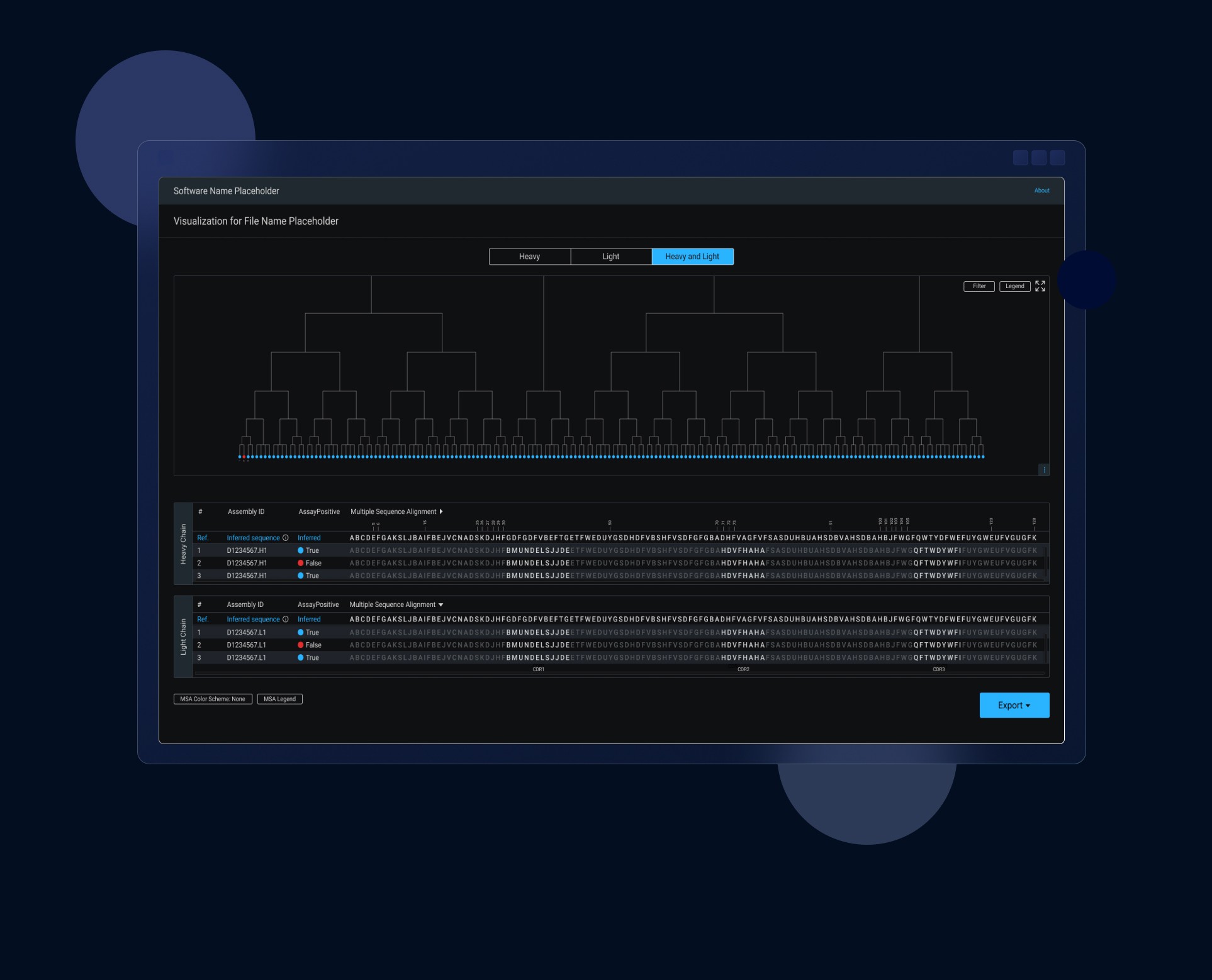
Allow visualization of multiple sequence alignment (MSA) of antibody genetic sequences.
I. Discovery

Competitive Analysis
Identify elements meeting one of Nielsen Norman's heuristic
Score a heuristic out of 5 by counting how many times a heuristic is successfully demonstrated on a page
A score of 4 out of 5 means that the competitor design is usable.

Findings
None of the competitors have consistent and accessible designs.


II. Define
User Flow

III. Design
Sketches
I made a few sketches trying to configure the new layout of the application page in order to improve the user experience and allow the visualization of two tables.

Wireframes


Mockups


Usability Testing
I conducted several rounds of usability testing of our high fidelity mockups. Some of our observations are:
Users were trying to scroll through each table
Users were trying to sort the tables
Findings
Users want minimal visualization with sufficient data

Iterations
Allow tables to scrolls simultaneously
"Color Schema" filter button is difficult to find
Legend buttons are inconsistent
Make tables and data visualization to be resizeable

A/B Testing
As I presented my mockup iterations to my team, questions were raised if my design was the best solution for our users. Would two dendrograms in the same page help or are users satisfied with just one dendrogram? To solve this problem, I conducted an A/B testing of two mockups using SurveyMonkey. The goal was to allow users to choose which mockup optimally presented the data. The image outlined in green was the design preferred by all the users


IV. Deliver
Results
This feature allowed our users to accurately and quickly identify mutations on antibody genetic sequences. Moreover, allowing the development of vaccines to begin sooner.
Next Steps
Adding a dual visualization of heavy and light chain MSA’s was a challenge, but I must keep in mind other elements in the page that I could iterate to enhance the user experience, such as clarifying the reference sequence section of the MSA table.
In addition, a new expand button that allowed users to fully view the dendrogram and select specific nodes within the expanded view would be a future assignment to tackle.
