HOUSE2HOME
An E-Commerce website helping new residents find the right interior design
UI/UX Designer
Springboard
E-Commerce
Figma
Impact
Help new residents search for interior designs that fit their aesthetics and budget.
The Problem
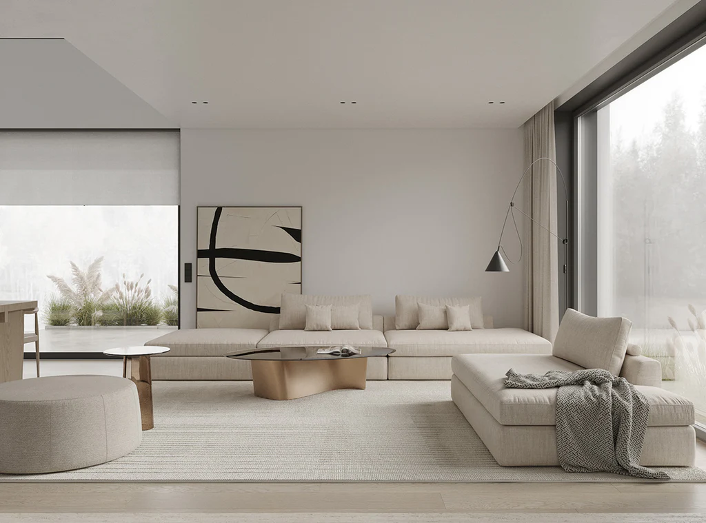
Source: Vauntdesign.com
New homeowners often face challenges in finding and purchasing furniture or decor that aligns with their personal style and the aesthetic of their new space. There is a need for an intuitive, user-friendly e-commerce platform that helps users quickly discover items that match their ideal interior design, making the process of furnishing their new home more seamless and enjoyable
Goal
Understanding the problem space and drafting userflows
Competitive analysis and sketching
Storyboarding
Designing and prototyping
Usability testing & evaluation
I. Discovery


Understanding the Problem Space and Drafting Userflows
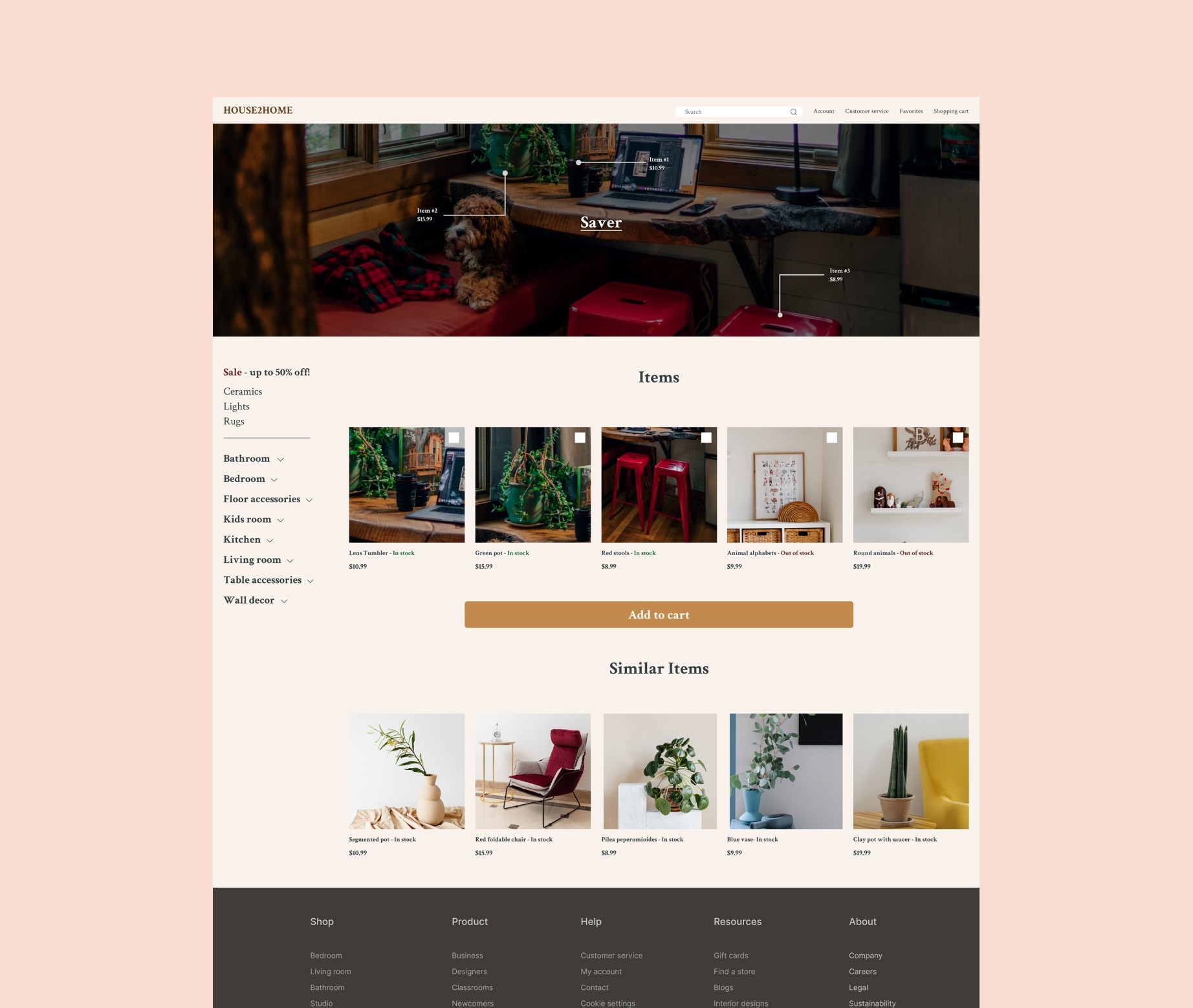
House2Home was designed for people who recently moved to a new home and were looking for items to decorate their space at an affordable price. A website would provide users with inspiration and bundles of images with prospective interior design that matches the user’s intended style.
II. Define
Competitive Analysis and Sketching
House2Home was designed for people who recently moved to a new home and were looking for items to decorate their space at an affordable price. A website would provide users with inspiration and bundles of images with prospective interior design that matches the user’s intended style.

reDesign home
ReDesign home was designed for boutique interior design studio that seeked to provide the necessary items for renovations. I liked that the website showed a picture of an item first and then allowed a user to click the item to get more details.The website was clean, bright, and provided detailed dimensions about their products.
H&M
The H&M website was a common clothing eCommerce website. For this website, I focused on the steps it took to purchase an item. The transaction process did not allow a user to complete a payment if the user had not completely entered their personal, billing, shipping, and payment information. This was shown by the “Almost done” button being grayed out and unclickable, and this button turned into a clickable black color once the necessary information had been filled


DJI
The DJI website had minimal UI elements and large pictures to showcase their products. This helped users find unique items easier without having to scroll through a list of categories without pictures.The product page of the website also showed each item that they were advertising with its own section and detailed views. The website was very organized and presented a summarized description of each product prior to accessing the corresponding item page.
III. Design
Sketching / Crazy 8's

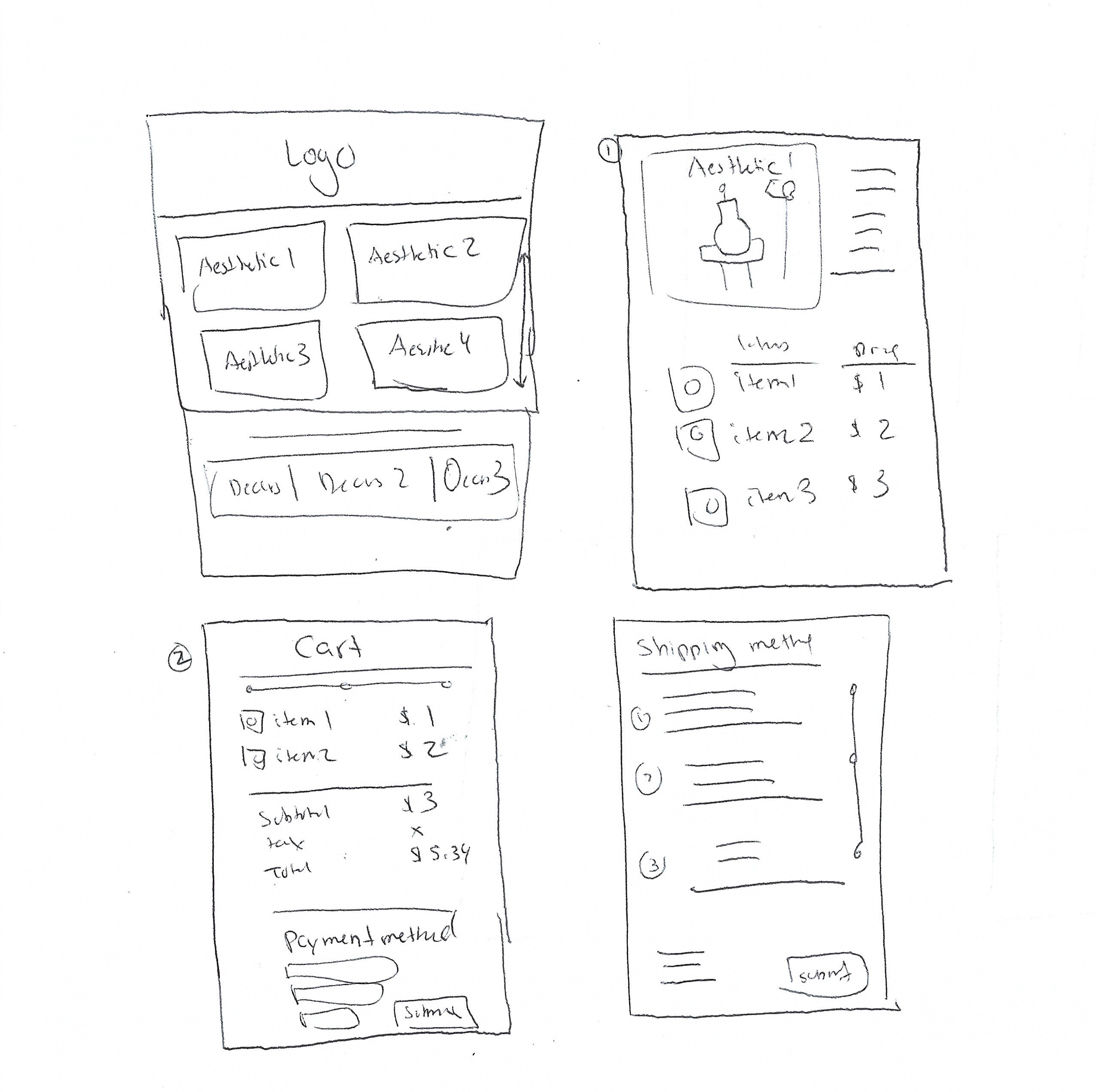
Final Sketch

Storyboarding

Prototype

Usability Testing
I tested my prototype with 5 participants who were either interested in buying accessories to decorate their home or are new occupants of a home, or apartment, that wanted to find an interior design that best fits their space

Findings
1. Text alignments in the "order details" section.
2. Button consistency
Iterations


IV. Deliver
No actual product was delivered since this was a fictional project through Springboard's UI/UX Design bootcamp.
Lesson Learned
The modified Google Venture design sprint allowed me to conduct a solo design sprint within five days. This was my first design sprint and first e-commerce UI/UX experience. I learned to prioritize critical elements to develop a prototype that strived to be a deliverable. This session taught me to understand the problem space, create valuable screens that accommodate the target audience, and understand my place with a team when user research was provided.