Traq
A subscription and budget tracking app

UX Designer
Springboard
Figma
Impact
Improving people's financial health and awareness on excessive subscription spending.
The Problem

Source: Pexels.com
A fictional company wants to solve people's problem that are struggling to track their subscription expenses and improve their overall financial health
Goal
Create high fidelity designs in 2 weeks
Establish an information architecture
Create a responsive design that is adaptable to an apple watch.
I. Discovery
As my second capstone project at Springboard's UI/UX Design Bootcamp, I was given the following information:

Users
Don't have effective communication about events
Need an incentive to attend events cost-effectively
Between the ages of 32–55 years old
Equal split between men and women
Use phones and desktop applications equally

Brand
Trusted friend that cares about helping people and making a difference in the world
Caring, familiar, humorous, optimistic
II. Define
Based on the information that I had, I established a roadmap that will help me complete this project in 90 hours spread across 19 days.
Day 1: Roadmap, Style Guide, and Logo Design


Days 2 to 3: Competitive Analysis


Day 4: Information Architecture

Day 5: Userflow

III. Design
Day 8: Wireframes


Days 9 to 10: Usability Testing (Low Fidelity)


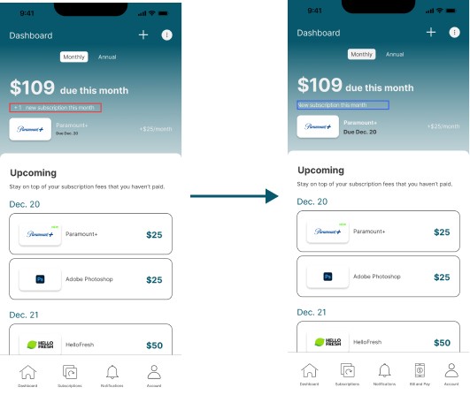
Problem:
In the dashboard page, the users were confused about the fraction “$109/$150” where “$150” is in a smaller text.
Solution:
Remove “$150” and change the header to “$109 due this month”


Days 11 to 15: Mockups


Day 16: Prototype
Days 17 to 19: Usability Testing (High Fidelity)


IV. Deliver
This project was not handed-off to a development team as this was a capstone project for my UI/UX Design bootcamp
Lesson Learned
This second capstone project was unique compared to the other projects I encountered through Springboard because the project provided me with user research, brand personality, and a target audience. In this situation, I needed to take the fictional company’s information and relate it to a mobile app design that best fits the company’s idea and goals. This time around, I took advantage of UI kits by putting different kits together in order to form Traq’s design. I learned the value of usability testing and how it was a crucial element to help adjust UI elements to improve the overall user experience, and also took in feedback from participants in order to help establish future goals for the product
Next Steps
In addition to the mobile prototype I designed, I also dove into designing a few high fidelity frames for the apple watch! Here you can see a mockup I designed for the dashboard, subscriptions, and unsubscribing screens.
